Book Formatting and Interior Design: Essential Elements for Print and eBook Layouts
You've worked hard to create an amazing book and are ready to get it published. But what is your bestseller actually going to look like? Understanding the essential elements of book formatting best practices will allow you to make sure the content of your book doesn't just read well but is also presented in a way that is appealing to readers. Here's our guide to the differences between ebook and print book layouts, how to go about designing ebooks for readability, and some need-to-know tips for print and ebook layout.
Interior Design for Books
In a moment, we'll dive deep into the differences between print book layout and ebook layout when it comes to book formatting. There are, however, some basic components most books will have, whether they are physical books or digital renditions. Let's take a look at some important aspects of interior design for books.

Title Page
This is the signpost for your book. The title page contains the book's title. This page is important because the style and font of the title will tell readers a lot about your book. Choose a font that goes well with your genre.
Copyright Page
A page containing essential legal information must be included. For a professional book interior design, you need a copyright page that is clear and contains all the relevant information. Your copyright page should have publication details (who published it and when it was published), information about who owns the copyright to the book, necessary legal information, details about the design and printing, and ISBN information.
In most cases, a member of the publishing team rather than you, the author, will write this.
Table of Contents
This is the map of your book. The table of contents should clearly list each chapter and heading of the book with the page number it begins on across from it. It is vital that this be a neat, tidy, clean-looking page that is easy to understand so that people can navigate your book.
Preface
This is a personal page where you can share part of your writer's journey. While the book itself will tell a story, this is where you tell your story as the author of the book. This is completely separate from the main next; it is a space for you to get personal and share your motivations for writing with the reader. You may include the purpose of what you wrote, the context in which you were writing it, and why you were the person to tell the story.
It is important to note that the preface is written by the author themselves and is different from the foreword, which is written by someone other than the author.
Headers and Footers
These are sections of pages that run throughout the book. The header is the space at the top of the page, and the footer is the space at the bottom. These are essential elements of book formatting, as they allow you to give information like chapter names and footnotes. When it comes to professional book interior design, the headers and footers should be big enough so that the information is clearly visible, but they should not intrude upon the rest of the text.
Page Numbers
Page numbers should correspond with the ones in the table of contents. Generally, preliminary pages will use Roman numerals to distinguish themselves from the main text. In book formatting, the page numbers should be in a consistent location, usually at the bottom right of the page or in the header in the middle. Blank pages don't usually have a page number.
Chapter-Heading pages
These pages tell the reader what section of the book they are reading. It is important that the name of the chapter or heading correspond with the name listed in the table of contents.
Subtitle
Oftentimes, in book formatting, you may consider having a subtitle page. This page will contain the title of the book, with a smaller title that gives some more information on what the book is about. The subtitle should be smaller than the title.
These things need to look good and be in keeping with the book's style. You may feel like you want to get creative with these sections, which is okay! But remember not to overdo it. These are some of the essential elements of book formatting and professional book interior design.
Print Book Layout vs. Ebook Layout
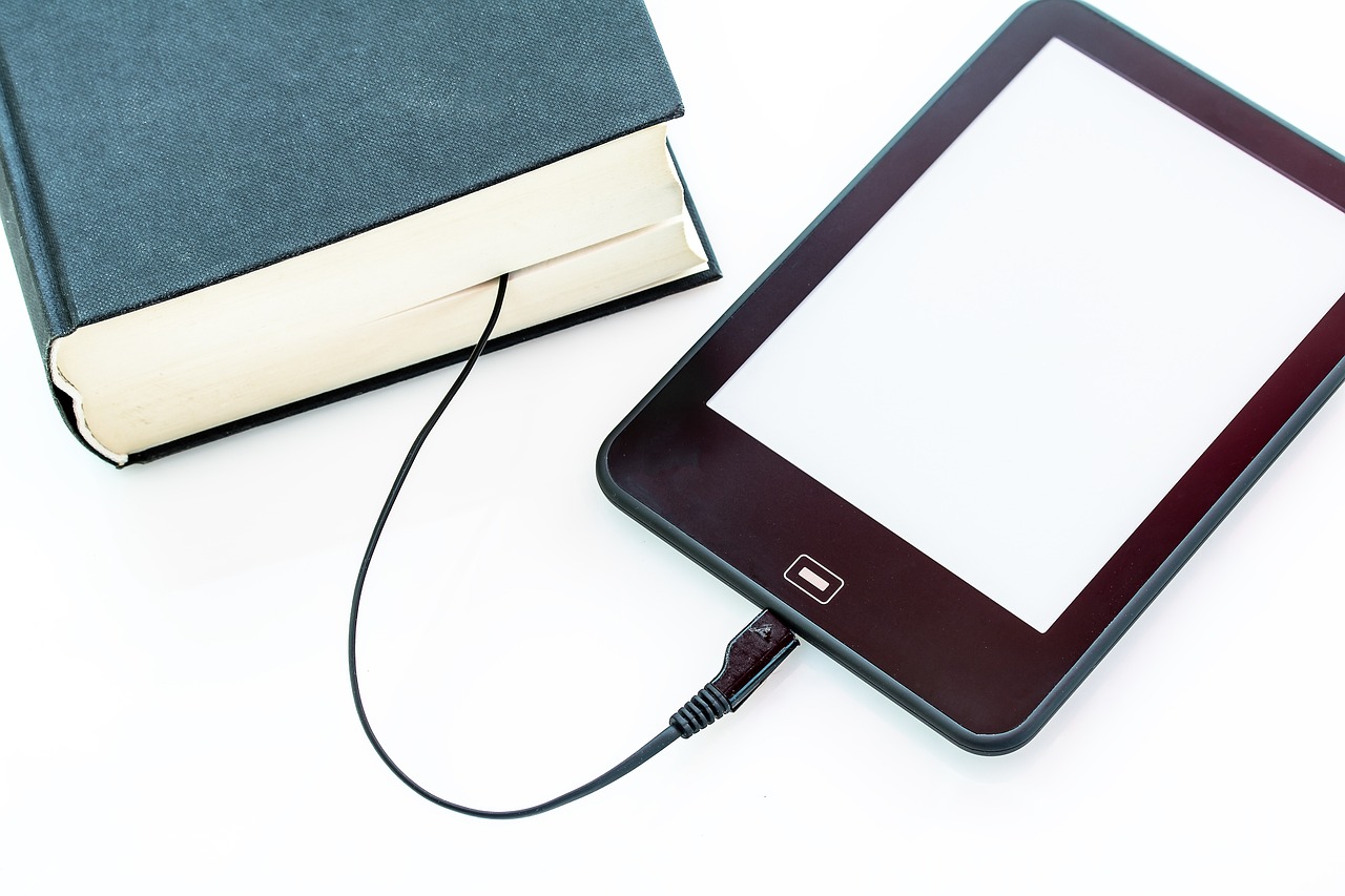
There are a lot of basic differences between print books and ebooks. Print books are actual physical books made of a cover and sheets of paper. You turn the pages as you read them, and they take up physical space. On the other hand, ebooks are digital. They exist on an electronic device and are downloaded. There is no paper involved in an ebook, and rather than turning the pages, you scroll through different sections. While individual ebooks tend to be cheaper than individual print books, the device needed to host ebooks tends to be of significant cost. While printed books need to be stored somewhere in the real world, ebooks don't take up physical space but rather take up storage space on a device.

Book Formatting Differences in Print Book Layout and Ebook Layout
Crucially, once a printed book has been printed, it has a fixed format that cannot change. That is to say, the layout and structure of the text will stay the same. However, when it comes to designing ebooks for readability, they are required to have a much more flexible layout that can change depending on the host device and the settings that the reader wants, i.e., font size. Here are some other key differences in book formatting when it comes to print books and ebooks:
- Print books have a front and back cover; this is, of course, necessary to protect the pages. Both the front and back covers can be designed to be attractive to the target audience. While ebooks have a front cover, which will be shown on the website selling the book, they do not have a back cover.
- In a printed book, there will often be footnotes in the footer of the pages. These are often for references and additional information on particular lines in the book. When it comes to ebooks, instead of footnotes, they have endnotes, which are notes at the end of the book. As ebooks are interactive, usually, the text and the endnote it refers to are connected by a hyperlink.
- Speaking of interactive, ebooks have the benefit of having a clickable table of contents, making it easy to search throughout the books for different sections. It is also easy enough to search for the use of a particular term or phrase in the book, as you can do this through the device you are reading the ebook on. This is not the case with print books, as you will have to manually look up words in the glossary of the book to see where they occur.
So naturally, there are different considerations in terms of book formatting best practices to take into account when structuring a print book and an ebook.
Print Book Layout Considerations
As your print book will exist as a physical book, there are physical considerations to take into account. You will need to factor in the size and thickness of the book as well as the number of pages? This will be influenced by the spacing in the book and the size of the font and images. For book formatting best practices, it is important to know what size your book will be before making other decisions on the layout.
Because your book will look different on the screen than on the page, it is important to consider your margins and bleeds. The middle margin (known as the gutter) is particularly important to factor in, as it is where the binding of the book will be and so needs to be wider.
Your book cover is a chance for you to get creative and try out different ideas. And remember, it's best to do some research when planning the interior design of books, as there are often expectations for different genres and types of books.
The new book smell will be even nicer if your printed book is formatted the right way.
Ebook Layout Considerations
We know that when it comes to ebooks, they are more flexible than a real physical hard copy of a book (and there's no fear of paper cuts!). While a print book will only be read in one form, an ebook can be read on a multitude of devices; one person could read the text on a laptop, another could read it on a tablet, and someone else could read it on a phone.
So what's the big deal? Well, the thing about those different devices is that they are all different shapes and sizes. Phones are smaller than tablets, which are smaller than laptops. On top of that, you have different-sized windows within these devices. This complicates things when it comes to formatting.
Have you ever been on a website on your laptop and thought it looked great? Then you go on the same website on your phone, and suddenly everything is cramped and difficult to navigate? That's because the website has not been optimized for different devices. It is crucial that your ebook has a clean layout that works on many different devices and that the contents are well organized. Designing ebooks for readability requires you to keep things simple and tidy. The design of the cover and any artwork should be consistent with your brand.

Tips for Print and Ebook Layout
There are certain book formatting best practices to consider, regardless of whether you are working on a print book or an ebook. Here are four tips on how to ensure your masterpiece looks every bit as good as it reads.
- Focus on your font: If you've been writing your book for a long time, you are probably sick of staring at it at this stage! But it's crucial to remember that the words themselves have to actually look pleasing to the reader, who will not have seen your intensive writing process. A major element of the interior design of books that authors get wrong is their font. You want to avoid using the default boring font that makes your book look like a document your reader has been handed at work; you need something a little bit more interesting. At the same time, some fonts are strange, unclear, and even straight-up ugly. You want to ensure you pick a font that is easy to read and makes the words on the page look good. In keeping with book formatting best practices, you shouldn't have an abundance of different fonts, as this can be distracting and make the writing seem disconnected.
- Space issues, the final frontier of poor book formatting: You may have written a great bestseller, but if the spacing is all over the place, people will just get fed up and stop reading. Be aware of line spacing, and make sure the words aren't too tightly packed together. The margins need to be of good size too, with the centre margin where the binding of the book is bigger than the edge margins. And one of the essential elements of book formatting that people mess up is the text justification. Books are generally fully justified to avoid ragged edges in paragraphs. Speaking of paragraphs, most of the time, a new paragraph will start with an indent on the left-hand side.
- Consistency, consistency, consistency! If every other page of your book has a different layout, the reader will not be able to follow what is happening. The chapter names should look the same throughout the book and should look different from the regular text. The headers and footers should run throughout the main text with consistent information.
- Make your images picture-perfect: If you're going to have images in your book, they have to be of good quality and very clear. It's worth taking the time to get images that are of good resolution and color to add to your book.
A lot goes into crafting a great book, so make sure that if you're using a freelancer, you pick someone trustworthy and reliable who understands book formatting best practices.
In Summary
Once you've covered all the essential elements of book formatting when working on your print book layout or ebook layout, you'll have your next bestseller looking like the great piece of work it is. Follow the book formatting best practices we've outlined here, and your masterpiece will be in great shape. Don't know where to start? The Urban Writers can help!


