Blow Your Reader’s Minds With the 25 Bestselling Kindle eBook Cover Ideas for Self-Publishing the Next Great Hit on Amazon
Kindle ebook covers can grab someone’s attention at first glance or they can leave us scratching our eyes out. Some of them are so busy that it gives us a migraine when we try to make sense of them. It’s like we’re searching for Waldo.
We don’t need to make people quint and feel an urge to swipe along. There’s a secret that few people behind the curtains know. Psychology can help me explain how we can fascinate our readers before they even read the words on the cover.
Human beings are biologically programmed to respond to visual stimuli before they read words. Our minds conjure images in our imaginations before we even know what we’re thinking. Words can never have the same drive as images.
Why did television replace storytelling through radios in earlier decades? This is because people prefer seeing something. Yes, readers can imagine the words on a page if an author is great at what they do, but they haven’t read your words yet.
They’re looking for something in the design of your cover. Something that will give them a starting point to their imagination, especially in fantasy book designs. Fiction writers can use the creation of a cover to spark their reader’s imaginations.
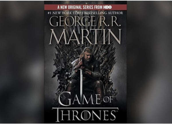
Think about the Game of Thrones series by George R.R. Martin. Some of his covers have given us an idea of what he describes in words. One book, in particular, has an image of the mighty sworded throne on the cover.
However, nonfiction writers have a second advantage because their covers can stimulate emotions in the reader. People allow their emotions to drive their decisions and that’s how you gain sales through visual stimulus.
Certain emotions are better than others. Excitement, overwhelming joy, and captivating curiosity are far more powerful than leaving a reader feeling disgusted or depressed by an image.
Creating the perfect design is an art form on its own for both fiction and nonfiction writers. It’s not just about adding a spruce of color and a dash of tasteful words; it’s also about appealing to someone’s emotional decision-making mind.
Designing Art to Draw Hordes of Readers In
Step right up and wow your readers with the perfect combination of words and images. The art you display on your passionate book is going to decide if people will be interested or not.
The Urban Writers (TUW) are the experts in cover designs, among many other services, and we want to teach you how to paint an unforgettable image.
The Unforgettables of Designing Your eBook Cover
Like any artistic taste in life, ebook cover designs will either make you disappear in the crowd or pounce at potential readers. There are certain ‘rules’ we follow when we design covers. A designer must remember to keep all of these in mind:
- Rule 1: What is the message to the reader?
- Rule 2: What does the cover say about the author?
- Rule 3: A designer should create a teaser to stimulate the reader’s imagination
- Rule 4: The artist must switch places with the reader and see it from their perspective. Will they buy the book based on the cover design?
- Rule 5: Is this cover screaming cliché?
There are also more intricate rules, which we’ll explain a little better.
Rule Six
The secret of balance is another consideration for our readers. The image mustn’t overwhelm the words and vice versa. Experts call this a text-centric design and it’s how we need to use the title, author’s name, and the image as balanced perfection.
Each cover must have a striking title that matches the image on the page. Titles have their own importance in cover designs and we speak about it on one of our blogs.
The author’s name must also stand bold at the bottom or top of the ebook cover. Sub-titles are optional and aren’t always necessary if the title is doing the right job. The image you choose should be supplementary to the boldness of your title.
Rule Seven
The spacing of elements can be a problem if not focused on. You don’t want your text to be on top of each other and take away from the title. Use symmetric spaces that are neat and allow the reader to see each word on the cover.
Rule Eight
Fonts are a touchy subject because some people think it will be great to use Algerian to look arty and others will think it’s awesome to slap some Edwardian Script into their biography of Theodore Roosevelt.
It’s tempting to add calligraphy to our covers to show readers that we are inspired by the period, but many readers have to revert to squinting and suffer from the inevitable migraine that follows.
We don’t need to stick to the boring Times New Roman font either and can use 20 or more other fonts to do the same. It’s about clarity and not art in this sense.
Rule Nine
Spice up your cover design with royalty-free high definition images that are easily available from Pixabay and Unsplash. Downloaded images should be in a portrait format and need to be thumbnail friendly.
Keep in mind that potential readers will see your thumbnail images before they open the actual cover design. This should be noted in balancing your words and images as well.
Also, don’t make your design square. Give people the closest thing you can find to a real book by designing a rectangular cover.
Choose descriptive images that tell a story on their own. You can search with keywords on these websites to find pictures that relate directly to your book. Keywords are just another essential marketing tool in any business or design.
Finally, personal illustrations are the first way you can give readers an insight into the mind of the author. That’s if you have the skills to draw a jaw-dropping image. Alternatively, find an artist who can create this for you.
Rule Ten
Research your competition because we gain valuable knowledge when we do this. Stick to the same genre and look at some bestsellers on Amazon to see what they’re doing right.
You want to take inspiration from them but you want your book cover to shout unique and original. Amazon is also a search engine and you can type keywords of similar books into it to see what’s trending in designs.
Bonus Rule!
Hush now because this is a secret rule only used by experts.
This is a little trick used by advertisers, book designers, and marketing strategists in every industry. Subliminal messages are the kinds that jump at our subconscious minds from the safety of their hidden spaces.
You can use the image to carry a subliminal marketing strategy or you can use the title to do the job. There’s nothing dark about this because even your supermarket does it when they pile sugary treats at the checkout lanes.
Even your color choices of your cover design can tease someone’s unconscious mind without them knowing it.
Designing the Winner
Authors have endless options to get their cover designed for them or use Kindle Direct Publishing (KDP) cover templates. Let’s see how you can put together the rules that you’ve learned about.
1. We can use expert services for cover designs from The Urban Writers.
Our specialist team can design a showstopping cover for you! They know what’s needed to make your book resonate with a reader. Our design team are artists rather than bots.
2. Amazon gives us a step-by-step guide on creating covers.
3. The Design Wizard also has some amazing templates.
4. KDP cover templates are an obvious choice and they even offer guidance on paperback formats too.
Fortunately, there are more tools to help us than we could ever imagine. We simply need to keep all the rules in mind and apply what we can.
25 Best-Selling Book Cover Designs
As promised, we’ll take a look at the best covers we can find and give you an idea of why we love them.
Expert Samples
The TUW team has designed covers that speak to the reader. We focus on getting a teaser message across to the reader to tempt them that little bit further.
- Love has an endless amount of lessons, just as the leaves come and go on a tree. Seasons change as people do and we can never stop learning about the person we love.

- This cover might look as though it has a busy background but the focus zooms in on the title. It tells us there’s a secret to the frightening idea of fasting by speaking of a trick, while we cannot miss the bottom-right corner that coerces the reader to turn the page.

- This cover has a deeper meaning than meets the eye. Take note of how the princess figure is surrounded by hints of nature. This could stir curiosity about getting back to our roots.

- Firstly, everyone wants a quick fix when it comes to weight loss. The title isn’t confirming this alone. The image of the blackboard and stopwatch supplement the words. A blackboard is a temporary writing surface and could also indicate swift changes. It all about using the title and image to answer a question.

- Simplicity at it’s finest is what we see here. Everyone knows that dogs are man’s best friend but the word transcendence alone can help us understand how the ancestor species evolved into the loving pet at the tip of our beds.

- This is an all-time favorite. It stirs curiosity at the deepest levels. Secrets are stored in our minds after all. The design gets us wondering if we’ll learn about this “secret house” by the end of the book. It grabs attention without needing to use a busy design.


Non-Fiction - Simple
Let’s take a look at simplicity at its finest. Many of these designs use white backgrounds to draw focus to the subliminal message, title, or image.
- Here’s another great example of keeping it simple and being straightforward.


- This one is incredible because it uses subliminal imagery with a tree trunk that shows the lines of its age. It’s also super because the title tells us that the author is knowledgeable.


- This one is perfect in nailing the target audience. Parents are always struggling to get their kids off their damn smartphones and pull those earplugs out.


- This one is a good example of subliminal imagery where you can tell what the book is inherently based on without reading the words.


- I can see the value in the image used here because science often refers to our brains as computers and computer language is made from ones and zeros.

- I like this one because it mashes the words and images together to create a simple, yet, artistic design.


Non-Fiction - Art
Now let’s rev it up a bit and look at more complex designs.
- I love this one because it looks busy at first but notice how the focus is moved away from the war in the background and shifted to the soldier. The cover tells you that this book talks about the immensely difficult life of soldiers.

- This one is perfection. The spacing is great and the image works with exactly what the author teaches. There’s no overcrowdedness either and both the title and image have value.

- This is another example of all the elements being in the right place and they are supported by a powerful image that says it all.

- I love the puzzle format used with the word speculation. This cover really gets my curiosity flowing. Besides, we automatically want to solve the puzzle by reading this book. It only has a few errors in typography.

- The Girl Boss says it all. The cover is clear on intent and there’s no busy fluff on it. The only image is an executive-type lady who also looks down to earth. The space between elements is good and subliminal messaging is rife.


Fiction - Novels
We must add a few novels to cover more ideas for you. Let’s see what we can find that jumps out at seasoned designers.
- Did you know that you can be spooky as hell without using gory pictures? This is one of the best covers out there because it stirs fear without giving us nightmares. We can’t see the dead after all.

- This novel’s cover strikes an emotion that makes us want to get to answers. We want to know what happens to her! The spacing is great again and the image is sad without being depressing. The flower replaces utter dread.

- This is one of the best covers out there. It uses a subliminal color to attract attention because yellow is connected to happiness. It’s brilliant beyond words and doesn’t need to say one more thing.

- The world at large is familiar with Dracula but we don’t need to add images of gore and teeth dripping with blood. This designer has used the connection between Dracula and the temptation of piercing people’s necks to do the job.


Fiction - Fantasy
Our final section will include some fantasy covers for the artists at heart. We cannot forget the people who manage to build a story from nothing but a tiny seed that was planted in their minds and grew into a massive realm of its own.
- Nothing screams “take me to a fantasy city” more than the mystery behind clouds. This is a great cover idea and draws readers in while the placement of the title and name is perfect.

- Why not create a puzzle in your fantasy novel? People will be trying to find the center of the maze and automatically be intrigued to find answers inside the book. This is a clever and simple cover with good word spacing.

- This cover stirs so many questions. What is this library and what is unwritten? This cover is almost dreamlike and I don’t mean this in a spooky way. The elements are perfect here and it draws attention to the mystery inside.

- This is fantasy perfection in our opinion. The cover attracts readers to find out who this person is? It could be based on real tribes in Africa or it can be based on an entirely new world. This cover promises to send a reader into fantasy.


This should give you an idea of different covers for various genres. The internet is filled with good ideas and then there are the covers that make you wish you could unsee them. Choose the ebook cover that people can’t stop looking at.
Designing Fantasy Book Covers
We don’t want to leave the fantasy book covers out of reach because it’s a true talent to create fantasy books. We have some amazing fiction ghostwriters at TUW who can help you get started.
However, fantasy writers must keep a few tips in mind for their cover designs.
- Plan to build a brand if you’re looking at writing a series.
- You can apply the same tips as nonfiction ebooks, with an added mystery in the design.
- Allow the images to create a tone for your work.
- Adding the main character image or plot to the cover can always go well.
- Design a cover that strikes the right amount of fear for horror stories.
- Stay away from covers that are too busy with dragons flying all over and a wizard stomping your title.
Fantasy authors can use generators to create names and plots for their stories. I’ll admit that you have far more freedom in your design though and you can go mad as long as you don’t overcrowd the page.
Final Thoughts
I must be honest. I’m terrible at keeping secrets and will share one more with you. Use the power of your social network to vote on various cover designs before you decide.
You can give people an option of three before you move onto publishing the ebook. An outside perspective can be hurtful at times, but it can also help us create the best cover out there.
All that’s left to do is for you to go and be a designer.